I keep waiting to share our renovation/redesign photos because I’ve only wanted to show our house all finished and perfect and completely decorated. But after a cold, hard look at the facts, I’m going to have to accept that at our current pace, our house will be ‘finished’ in, oh, 8-12 years. So despite a lack of décor and finishing touches, I’m going to start sharing it anyway. Just don’t leave nasty comments about how empty or unlived-in or undecorated it looks, okay? Actually, don’t leave nasty comments at all, about anything, I think that would be best.
I’ll start out with the room that is the most finished so far—the kitchen. As a reminder, here’s how the kitchen/dining area looked when we bought the house:

Honestly, I didn’t think it was all that terrible. The cabinets were in pretty good shape (although I’m not crazy about oak and have always wanted white cabinets), but the countertop was cracked and peeling (not to mention baby blue) and the floor was a very cheap laminate that was really showing its age and was starting to bubble up and split apart. It wasn’t a bad kitchen to start with, but I saw a lot of room for improvement and updates.
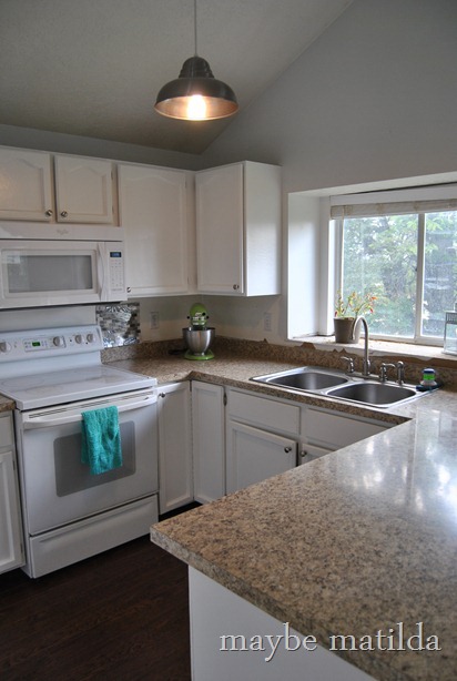
Without further ado, behold the new-and-improved kitchen today:

How’s that for a big change?!
You know, looking back and forth between those two pictures gives me the warm ‘n fuzzies. Let’s do it again, from another angle.
Before:

And now!

We’ve put a loooooooot of work into this room, and we were able to make most of the changes ourselves. We started by tearing out the old flooring (not just in this room, but throughout the entire house), and Jeff spent a few back-breaking days and nights replacing it with new wood laminate flooring. This wasn’t exactly a difficult task, according to Jeff (except for rooms with a lot of angles or closets to work into, which were kind of difficult), but it was time-consuming and very physically demanding. But the price to have the floor professionally installed would have been more than double the cost of the product itself, so it was an easy choice for us to do it ourselves (I’m using plurals pretty generously so far—I didn’t do a single thing to help with the flooring other than carrying planks around. Good work Jeff!). You can get a good look at the new floor in this picture:

I have LOVED our new floors. They are rich and dark and really put up a convincing front—I would have thought they were real hardwood if I hadn’t chosen and paid for them myself. We got the flooring from McCoy’s in Lehi, Utah. I really wanted to stay under $2 per square foot on the floors (we don’t have a huge renovation budget to work with, and expensive laminate or real hardwood could have easily eaten up most of our budget) and, if you’ve ever shopped for flooring, you know that this is a tough goal to work with. I stumbled across McCoy’s website and am so glad I did. If you are looking for laminate flooring and like the look of this one, GET MOVING. This is the only laminate that McCoy’s carries (the bulk of their business is in carpet and cabinetry) and our timing just happened to be perfect—they’re eliminating laminate from their stock and are getting rid of what’s in the warehouse at a huge markdown, so we got this flooring for $1.25 per square foot for the entire first floor of our house, coming in at just about 50% of what we had expected the flooring budget to be! One of our neighbors came over and fell in love with our floors and decided to redo their first floor as well, and they got the same product from McCoy’s a few weeks after us, marked down to $0.99 per square foot. And this is good quality stuff—it was comparable in thickness, brand, and durability to the $3+/sq. ft. products at Lowe’s or Home Depot. So if you’re local and planning a renovation, I’d recommend you visit McCoy’s quickly—we bought ours 2 months ago, so for all I know, they could already be sold out. (By the way, they’re not compensating me to say any of this—they don’t even know who I am unless they happen to remember me as ‘that girl who was doing cartwheels over our flooring’—I’m just really happy with the price and quality and look of our new floors and want to share.)
While Jeff worked on the floors, I gave the cabinets a makeover. This wasn’t at all a difficult task, but it was, like the floors, rather time-consuming. Luckily, we had about 2 weeks between the closing date on the new house and our move-out date in our apartment, so we had the luxury of turning the new place into a complete construction zone with torn-up floors, knocked-out walls, wet paint, and empty, half-painted cabinets for a little while before we had to move in.

It was pretty scary looking for those 2 weeks (and beyond). But even just a coat of primer on the cabinets gave me some hope for what the kitchen could look like when it was finished:

I won’t go into too much detail about the cabinet painting process—there are hundreds of very detailed posts and articles about painting/refinishing cabinets elsewhere—I’ll just say that it isn’t hard, and if it’s something you want to attempt, you shouldn’t be scared of it. I am far from a professional painter/DIYer, and I managed just fine. We installed some new satin hardware on the cabinets and drawers (and actually still haven’t finished this—if you look closely at the full kitchen shots, you’ll see that some doors/drawers are still waiting for knobs) which I think make a big impact. We got the knobs and pulls from Home Depot.

Next on our list was tackling those terrible countertops. We knocked out the baby blue counters ourselves (again, I’m using ‘we’ pretty generously here . . . I believe I stood around the corner and covered my ears while Jeff did the very loud dirty work) and lived for a few weeks with no counters at all (which is about as fun as it sounds) while we waited for the new ones to be delivered. This is the only piece of the kitchen makeover we didn’t do ourselves—we bought these countertops from Lowe’s and had them installed for us. The counters, like the floors, were a bit of a budget terror. As much as I would have loved granite countertops, they would have just about wiped our budget clean. I considered DIY butcher block or concrete countertops, but decided in the end to go with a laminate that made for a pretty compelling granite copycat. And I’ve been extremely happy with them—I think they are beautiful, and they don’t at all have the cheap, plasticky look that some laminate countertops have. We’ve even had a few friends and neighbors act surprised when we tell them they aren’t granite. Maybe they’re just being polite, but I think they are really lovely counters and I haven’t regretted our choice at all. We also tossed in a new stainless steel sink and faucet while the countertops were being changed. I think it looks great next to the silver knobs on the cabinets.

(Weird as this seems to me, the baby blue countertops continued up onto that deep windowsill. I haven’t decided yet what to put there instead, so it’s just plywood covered with dead leaves from my sickly ornamental pepper plant for now while I make up my mind.)
We painted the walls a light, silvery gray—Valspar Comet Dust—throughout most of the house. To be honest, I’m not sure I’d choose this color if I were starting over again. While it looks beautiful in the upstairs of the house where there is less natural light (I love it in Forrest’s bedroom and bathroom and in the upstairs hallway!), the downstairs of our house is SO bright with SO many windows that the wall color gets a bit washed out. But since our 20+ foot high ceilings make painting a HUGE endeavor, the very light gray walls are definitely sticking around for a while. And they’re fine—I like the color, I just wish now that I had gone a bit darker. Oh well.
Last but not least, the finishing touch, the cherry and hot fudge and whipped cream on top of the kitchen makeover that pulls it all together, are the stunning new light fixtures. Did you notice them?

You might remember that I entered the Barn Light Electric online giveaway contest shortly after we closed on our house. I never in a million years would have dreamed that I’d be a contender, but I won! I’m still in shock, and I stare in wonder at these beauteous light fixtures every day. This Saddlebred Pendant (which I cannot for my life find on their site now, I’m sorry for the lack of link) is a huge improvement over the previous fixture, a dinky little gold chandelier:

And I chose the Raven Chandelier for our dining area:

It makes for a great change from this monster:

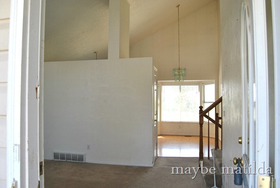
And I love the new look when you enter the house—here’s the view from the front door when we bought the house:

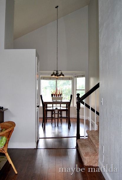
And here’s the view from the front door now (including a peek of our staircase makeover):

I’m getting the warm ‘n fuzzies again just looking at that ‘after’ shot. A million thank yous to Barn Light Electric for the gorgeous new fixtures—they give the place so much character and charm! Since this is really a rather cookie-cutter, builder standard house, I LOVE that these new fixtures give it a little bit of old-fashioned style.
On the to-do list for the kitchen/dining are to install a backsplash (we have it picked out [it’s propped up next to the stove in the pictures above] but just need to work up the courage to tackle it), install trim above the cabinets, and infuse some more color with décor, wall art, etc. I’m contemplating a colorful kitchen table makeover . . . we’ll see. And perhaps some bright, cheerful valances/Roman shades for the bay window.
Until next time. Thanks for stopping by.


