Maybe Matilda: diy home renovation
Showing posts with label diy home renovation. Show all posts

Tuesday, March 21, 2017

Darcy's Big Girl Flower Garden Bedroom

We're only a few weeks away from a new occupant moving into the crib, so it was time to boot Darcy out and transfer her to a big girl room!

I originally intended for this bedroom makeover to be a Christmas surprise for Darcy (although I never got as far as figuring out how to keep an entire room in our house a secret from her), and it is just now completed in mid-March, so that's right on track for my typical scheduling!


I recruited some design talent to put this room together -- namely, Kathleen of Lindsay Hill Interiors (aka Darcy's grandma) and she did a marvelous job of creating the perfect space for Darcy. We wanted to give her a room that was sweet and girly, without being babyish or too 'cutesy.' The results are a lovely, feminine space that can grow with her, and won't feel like a baby room as she gets older.

Needless to say, Darcy LOVES her new room.


Step 1 was getting this girl a Beddy's of her very own. Every member of this family now sleeps in a Beddy's bedding set and they are THE BEST EVER. Perfect trifecta of being simple to use, comfy to sleep in, and absolutely adorable. We picked out the Vintage Blush Beddy's for Darcy's room.

If you aren't familiar with this awesome product, it is an all-in-one bedding set (meaning, literally ONE PIECE of bedding from fitted sheet through top quilt) that zips up the sides similar to a sleeping bag. It is a one step, one zip process to make the bed in the morning, and Darcy can do it by herself. Hallelujah for one less chore for me to complete every day! Another perk for young kids transitioning out of a crib is that zipping it up to her armpits at night prevents her from falling out of the bed as she gets used to sleeping in a bed without side rails. Just awesome, all around.

If you'd like to see how we all use our Beddy's, you can see them at home in Forrest's bedroom HERE, and our bedroom HERE (those pictures are actually from our old house -- maybe someday I'll get around to photographing our bedrooms in our current place!).


Kathleen recommended a feminine accent wall, and she found this beautiful floral wallpaper from Milton & King. I found the idea of wallpaper pretty intimidating, but it turns out, wallpaper is pretty simple to hang (as long as you've got two sets of hands at your disposal, and bonus points if your designer has worked with wallpaper before and doesn't mind helping out!). It took us an afternoon to put the wallpaper up, and I love that it brings in some fun color and pattern without being overwhelming or too 'trendy' -- I have high hopes that this is a style that will look great for years to come.


This dresser was a vintage find that we refinished in a cheery yellow color before Darcy was born (you can see it in her original baby nursery HERE), and it looks perfect in this colorful, happy room.


This girl LOVES her stuffed animals and plays with them frequently, so we included a big basket in her bedroom for her furry friends to live in. And this shaggy, plush, comfy rug from Rugs USA is so soft and cozy that I keep catching Darcy lying on it, trying to make snow angels.

Darcy is absolutely loving her new room, and so am I! If you have questions about any of the items in her room, let me know and I'll do my best to answer :-)

Product list:
Zipper bedding, bedskirt, pillows: c/o Beddy's
Bed: Walmart
Basket, dresser, floral paintings, and many accessories: thrift store finds
Distressed letter "d" over bed: Hobby Lobby
Nightstand: thrifted, I believe originally from Ikea?
Lamp: Target
Wallpaper: c/o Milton & King
Rug: c/o Rugs USA

Monday, March 23, 2015

Selling Our House: Getting it Ready + Our Current Status

Thank you so much for your support on my post about selling our first home! We’ve put so much work and love (plus a fair amount of sweating and swearing) into this house, and it is so encouraging to hear positive comments on it.

I thought I’d write out the work we put into getting it ready to sell—not all the changes we’ve made over the past 3 years, but our ‘sell this house’ to-do list from the past few months—plus an update on the current selling status.

A giant house selling to do list

The ‘Sell This House’ To Do List

1) Declutter. Kind of a no-brainer, but it’s amazing how much junk accumulates in a house. We spent a weekend going through everything and deciding what to donate, what to throw out, and what to pack and store. And the house looks so much bigger now.

2) Caulk. Such a little task that makes a huge difference. We caulked along the top of all the trim, between kitchen cabinets, etc. It really makes the house look more tidy and finished.

3) Transition pieces. One of the downsides of installing your own flooring, we discovered, is that you get tired of the process and decide you’re done before the job is really 100% finished. We had left a few areas on the floor without transition pieces because we were just tired of it, so we finally went back in and added them. Wish we’d done it earlier.

4) Clean up trim. I had no idea, until I got right down on my hands and knees next to it, how dingy and dirty our baseboards were. I scrubbed all the trim in the house, then repainted it so it looks crisp and fresh. Fresh, bright trim is a smallish detail that makes a huge difference in how clean and bright the house looks.

5) Corral the toys. Somehow, the kids ended up keeping toys in basically every room. I figured the house would be so much easier to keep tidy for showings if we a) got rid of some of their toys, and b) stored them all in one spot. I went on a ruthless toy purge and threw away anything that was broken or missing pieces, tossed anything that was cheap junk, or that they’ve outgrown or haven’t played with in ages. Some toys were donated, and a lot went straight into the trash.

Then I moved all the toys down to the basement into a cubby and baskets, and I make sure the kids put things away before they get out a new toy to play with. It’s a bit of a pain to force them to clean up as they play—it means keeping a near-constant eye on the toy count and what they’re playing with or abandoning—but it makes it so much easier to straighten things up quickly. Our little toy storage area is pictured below—all of their toys are in those baskets, and hopefully we can get the kids into the habit of tidying up as they play.

basement toy storage

6) Putty over wall anchors. Previous owners/tenants in this house sure loved plastic wall anchors—nearly every wall in the house had empty wall anchors poking out, and I’ve never bothered doing anything about them until now. We hammered them in, puttied  over them, and repainted those areas.

7) Clean blinds. The most unpleasant cleaning task, if you ask me. Blinds are such a pain to clean, but a good scrubbing left them looking much improved.

8) Scrape and stain the deck. The little deck leading into our backyard has been an eyesore the entire time we’ve lived here. Initially, we thought we’d knock it down and build something bigger . . . but we dropped that plan in a jiffy when we realized how much it would cost.

We hired a handyman last month to take care of the deck—he used a power sprayer to knock off all the old, chipped paint, then gave it a fresh coat of dark stain. It looks worlds better now, like a place you might actually want to spend some time.

dark stained deck

9) Basement work. Our little basement dungeon needed the most help (and was the most expensive project to finish). We had new carpet installed on the stairs, hired a painter (I could have painted it on my own, but once we realized what it would cost to hire this job out, it felt worth every penny not to have to deal with painting myself), and had the handyman replace the broken basement window and build out a window sill, as well as repairing a section of the ceiling that needed new drywall. It kills me—we never used that basement for anything other than storage, but it is now a fantastic exercise and play room, and I wish we had fixed it up years ago.

10) Clean everything. This was the easiest but most obnoxious task. You don’t realize until you really inspect it that every surface within the kids’ reach is just nasty. Areas that got a much-needed scrubbing include: every wall, from about chest-height down (so, as high as Forrest can reach); all the doors and doorknobs; light switches and covers; outlet covers; windows; the stair rail and banisters. All clean and shiny.

11) Spring-ify the yard. An inexpensive and easy job—we added fresh mulch to the flowerbeds, tidied up the bushes, and added fresh flowers to our planters.

Okay, I’m cheating—this picture is over a year old. We have since replaced the outdoor lights, and of course there is now fresh mulch and different flowers in the planters. But I’m too lazy to go out and take a new picture, and this one gets the point across just fine.
yard for spring

We hired a handyman for some of the tasks—mainly the ones that required any skill at all. All the stuff that was within our realm (like cleaning and organizing) we did ourselves, and it was a pain. It’s so hard to get anything done with kids in the house. We plowed through as much as we could each weekend for a few weeks in a row, and I fit in whatever cleaning/organizing I could every day.

The Current Status

Our first day on the market was completely insane—we had showings all day long, and after leaving the house with the kids in the morning, we couldn’t come back home until after 8 PM. The final tally for that first day was 10 showings (although our realtor admitted she lost count, and it may have been higher).

We had 5 showings the following day, spaced out just enough to be terribly inconvenient and leave us stranded out of the house all day again. We were running on two straight days of fast food for every meal, crappy naps (if any!), and overly late bedtimes for the kids. We were all getting pretty cranky after a mere 2 days.

By day 3, I was hitting my limit (already! it only took 3 days to break me!). A number of showings were scheduled for the day, and I was getting frustrated. It felt like we couldn’t live in our own house anymore—we hadn’t been home in 3 days except to sleep, and I had no time to cook or do laundry or get anything done between showings. None of us had eaten a decent meal for 3 days straight, and we were running out of places to go to pass the time. During one interminable mall visit, Forrest asked, “Is our house selled-ed yet? I just want to go home.” Me too, kid.

maybematilda.com

Extra depressing was hearing feedback from some of the people who had seen the house. Our realtor talked to 3 people who had come through, and none of them liked it. It felt like a huge blow—after all the work we’ve poured into this house in the past 3 years, no one had a single nice thing to say.

None of their complaints were anything I should have taken personally, but of course I felt crushed anyway. Someone didn’t like the floors, someone else thought the bedrooms were too small, etc. We honestly believed this was a great house for the price range, and it was a big letdown to hear 3 negative comments in a row without getting any positive feedback.

I was all sorts of depressed about how chaotic and stressful selling was turning out to be, and was actually near tears as I complained about it to my mom, right when the realtor called with some awesome news. Two offers had just come in.

One was a pretty lousy offer—way below asking price, requiring us to cover closing costs, and with some crappy contingencies. It was kind of insulting, to be honest.

But the other offer was solid. It was below our asking price, but the buyer was covering closing costs, and our realtor is representing him as well as us, which reduces her commission. When we factor in the money we’ll save on the realtor’s reduced commission as well as not having to cover the closing costs, it comes close to being a full price offer.

Update 3/24: Well, never mind. The buyer cancelled his offer before we even had a chance to move forward. So disappointing!

We took it. We are currently under contract, and if you’re the praying type, would you send a prayer or happy thoughts or good vibes or whatever you happen to believe in that everything goes smoothly from this point on? We don’t expect anything big to come up on the inspection, but of course I’m in a panic over it anyway (that’s just what I do, and I’m so very good at stressing that it would be a shame not to). If all goes well, we’ll close at the end of April.
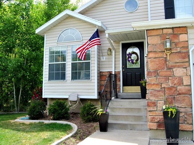
house exterior

The question now, of course, is where we’ll be heading? Frankly, we don’t know. We’ve gone out with our realtor a few times, and I am just not loving anything yet. There are lots of houses that feel okay to me, but nothing that I’m really crazy about so far. And I don’t want to rush into buying something I don’t love, just because we’re in a hurry and feel like we absolutely have to make a decision RIGHT NOW.

At this point, we’re leaning towards building, which means we’ll probably rent while we figure out if and where we’d like to build, and get that process started. Everything feels very hectic and overwhelming right now, but we’re trying to keep a level head and make decisions based on what we really want long-term, and not just what seems like a quick solution in a stressful time.

In the meantime, cross your fingers that the next few weeks pass really quickly . . . and without any unpleasant surprises.


Wednesday, November 26, 2014

Fireplace Makeover: From Old Orange Stone to Crisp White

From the very first time we saw our house, it was obvious that something needed to be done about the fireplace. I remember wondering, when we decided to buy the house, what we could possibly do to improve it, and all my brainstorming got me nowhere. It was just so big, and so dark, and I couldn’t come up with any ideas to improve it that didn’t involve a lot more time and money and talent than we have. But we got distracted by more pressing needs in the house—new carpets, new floors, new paint, new kitchen—and I more or less forgot about the fireplace until my mom mentioned recently that she thought it might look nice painted white.

I was a little nervous about this, but one of the side effects of having an interior designer for a mother is learning to just agree with whatever she says without thinking too much about it. She’ll always be right. It’s like when people try to argue with Stacy and Clinton on What Not To Wear. Come on, folks. Even if you don’t see the vision, just accept that these people know more than you and go along with it. Trust the professionals.

Even though I trusted that my mom was right and it would be better after we were finished, it was a bit of a nerve-wracking project. The stone fireplace was ugly to start with—I don’t even like this stone on the exterior of the house, and certainly don’t want it inside—but painting it felt so permanent. What if it looked silly? I doubt we’d be able to undo it.

Luckily, I don’t need to worry about undoing it, because it turned out beautifully. (Mom was right. Thank you Mom!)

DIY Fireplace Makeover

Now that, my friends, is a change for the better. Mama knows what she’s talking about. I shouldn’t have been nervous. Even the TV, which I’ve never liked above the mantel (but there really isn’t anywhere else we can put it), looks like it makes more sense up there now.

Once again, I will assault your eyeballs with the unappealing image of the ‘before’ fireplace. This is what we started with when we purchased the house. Pardon the small child walking through the frame. (Look how teeny he is!!!)

fireplace before

You can barely see, on the far right of that picture, that there was a very awkward wall partway through the room that blocked it off from the rest of the house and gave the room a funky shape. We knocked that wall down, which opened the room up to the hallway and a few stairs that lead to the kitchen, so this room is now partially visible from the main floor (which should have been an incentive to get moving on making the fireplace look better, but wasn’t).

We also tore out the carpet and replaced it with a dark wood laminate, painted the room a soft blue (a little softer than I had intended, actually—I don’t think a single paint color in this house came out as deep or impactful as I had planned), and replaced the big, dated fan with a pretty schoolhouse light fixture from Barn Light Electric. The room was definitely improving by leaps and bounds, but the fireplace still just seemed like an eyesore. I never could figure out a way to decorate it that made it seem less gigantic and intrusive, so I gave up and ignored it for a long time. Two and a half years, to be exact. (And once again, the universe gets a nice chuckle over Jeff and I thinking when we purchased this place that we would be done with our renovations within 4 months of moving in.)

fireplace before

And then comes mom and her crazy ‘paint it white’ theory. We got together last week, distracted the kids with snacks and Netflix, and got to work. We wiped down the stone to make sure it wasn’t overly dirty or dusty, and taped off the firebox and edges of the fireplace. We taped around the mantel, too—we originally planned not to paint the mantel, and changed our minds later. We started with a coat of Kilz Premium Primer, and let me tell you, those first few strokes were scary with a capital S. (And by the way, we brushed everything on by hand with 2” brushes—the rocks were too bumpy and craggy to use a roller, so it had to be done by hand . . . and yes, it was slow going. Thank goodness Mom was willing to help out.)

Stone fireplace makeover

After the primer dried, we followed it up with 2 coats of Valspar Ultra Paint + Primer. The hearth required 3 coats of paint. I had thought, when we started, that I might like it with the mantel left natural, but after painting the fireplace and peeling all the tape off, neither of us liked how the natural mantel looked. So we went back and primed and painted it, too. (And while we were at it, we repainted all the trim in the room, too—it looked so dingy and yellowed next to the bright white fireplace.)

fireplace makeover

My mom has had two older, espresso-colored ladder bookshelves sitting in her garage for a few years, unused and unloved. She donated them to the cause, and we gave them a few coats of white spray paint while we waited for the fireplace paint to dry, then brought them in and put one on each side of the fireplace. My mom styled them (sadly, I have no talent for this sort of thing), and we couldn’t resist decorating for Christmas just a little bit early.

DIY Fireplace Makeover

DIY Fireplace Makeover

This room is sort of long and skinny—out of frame in the picture above, we have a very old piano (we think it’s about 100 years old!) (and has probably been tuned about 3 times in those 100 years—just another item on the to-do list). And I couldn’t take pictures with the piano in the frame because it’s currently covered in toys and all the fall decorations we took down to put up our Christmas décor.

DIY Fireplace Makeover

DIY Fireplace Makeover

DIY Fireplace Makeover

This picture is horribly out of focus but I had to include it because I’m so excited to finally have a use for these adorable Coke crates I’ve been hoarding for years without ever using. The Coke boxes were the perfect way to bring some color to the shelves and keep some books corralled. I can’t even tell you how pleased I am that all my books are actually part of our house/décor now, instead of being hidden in boxes in the basement.

DIY Fireplace Makeover

What do you think of our fireplace’s facelift? And what was your scariest home makeover project?

Wednesday, November 5, 2014

How I Made My Vintage-Style Groceries Sign

Last week, I showed off my new farmhouse kitchen table (if you missed it, you can see it HERE). The love burns on—I’m crazy about it and think it’s perfect in our kitchen. Big purchases are scary for me. This one worked out; no regrets. (So far.)

Tutorial to make a vintage-style 'Groceries' sign for your kitchen // www.maybematilda.com

Seeing the new table in our dining space gave me a push to take on a project I’ve been thinking about for months and months. And since I love the modern farmhouse look ( <—is that a thing?), I thought a banged up, vintage-style sign could be perfect above the window. I waffled for months and months, wondering how it should look and what vaguely food-related word or phrase could go up there, then wondered how on earth to make the dang thing. But with the dual arrival or my new kitchen table and new Silhouette, it seemed like the time had finally come to go for it. I loved the look of this sign I found on Pinterest, and used it as a model for my own. So here’s how I made mine.

Tutorial to make a vintage-style groceries sign // www.maybematilda.com

I started with a piece of scrap wood that’s been sitting in our garage for at least a year. Who knows where it came from. I bet it’s happy to finally have a purpose (other than having me occasionally run over it by accident with my car). It’s about 12.5” tall, and it was quite long—I had Jeff cut it down to about 54”. I gave it a very light coat of white paint and left it to dry while I set up my design for the Silhouette.

I planned to use vinyl to create a stencil, and I wanted to cut the stencil all in one big piece, but the Silhouette cut mat is definitely nowhere near the size of the wood I was using for my very long sign. A little googling revealed much coolness: you can tell the Silhouette that you aren’t using the cutting mat, and just feed the vinyl straight into it. You can adjust the height to anything you’d like and cut a gigantic design. Super cool.

Tutorial to make a vintage-style groceries sign // www.maybematilda.com

In page settings, I set the height to 67” (which was way longer than I needed, as you can see——I scaled it back after I finished designing). I also selected ‘none’ for the cutting mat, and just inserted the vinyl right into the machine, straight from the roll.

I downloaded a new font that I thought had a great vintage look (I got it from Dafont.com and it is called Market Deco), and set up my letters just how I wanted them to look, then cut them from the vinyl.

My original plan was to lay the entire vinyl piece over my board, all in one go. This turned out to be way more difficult than I had anticipated. I believe Silhouette makes a transfer material so you can easily move vinyl pieces where you want them to be—I don’t have any of it. My solution was to cut my letters apart, then place them on my board one at a time, lining up the cut edges like puzzle pieces. I still think this worked better than cutting the letters individually—even though I laid them one at a time, they were spaced exactly how I’d designed them, so I could line up the cut edges perfectly. It worked great, although some letters were a bit finicky (I screwed up royally trying to save time by doing the C and E together, and ended up having to recut those two letters and do them again). I applied them all to my board and ran my finger over all the edges one final time before painting, just to be sure they were pressed down tightly. Then I used a sponge brush to lightly sponge black craft paint over the letters.

Tutorial to make a vintage-style groceries sign // www.maybematilda.com

I wanted this sign to look old and worn and battered, so I didn’t worry about getting it perfect. My paint job was thicker in some areas and thinner than others, and I liked it that way. I didn’t go back over for a second coat or try and make sure everything was evenly coated. After painting all the letters, I peeled the vinyl off. A little tip: a seam ripper works beautifully to get into tight areas or to pull up smaller pieces.

At this point it was almost midnight, so I went to bed and let everything sit overnight. In the morning, I gave the whole thing a go-over with some sandpaper. I considered dry brushing some watered-down black paint around the edges to give it more ‘wear’—I still may. Our walls are technically gray, but they came out so much lighter than I’d planned and basically look white. And the sign is white, so maybe a little extra wear/color around the edges would help it stand out more. Maybe I’ll go back and change that someday, but I’m not sure if I care enough to re-start a finished project. Either way, here are the sanded-down letters up close:

sign2

I attached some photo-hanging hardware to the back of the board, and Jeff helped me hang it up above the window. I sure like it.

Tutorial to make a vintage-style groceries sign // www.maybematilda.com

Tutorial to make a vintage-style groceries sign // www.maybematilda.com

If you wanna see more of our kitchen renovation:

‘Before’ house tour
Initial kitchen changes
Adding color
DIY farmhouse table

Friday, July 5, 2013

Baby Girl Nursery Inspiration

Goodbye, craft room. You will be missed. Well, sort of. I will not miss your constant state of disarray, the untanglable mass of knotted yarn blobs in your closet, and your complete lack of organization. Hopefully I can create in you a state of order, peace, and harmony that was never present there before.

I’ve been checking out nursery ideas, and I have to tell you . . . girl stuff is over. the. top. Whoa. Really, just search ‘baby girl nursery’ on Pinterest. Did you even know there were so many shades of pink in existence? Were you aware that every wall must be decorated with a gigantic vinyl cutout of some sort? (Acceptable choices: owls, huge monograms, quotes in cursive.) That all bedding/pillows/curtains must meet government-regulated minimum ruffle counts? I never realized there were SO MANY WAYS to display a baby’s name/initials. Or that it was necessary to do so. Will I not be allowed to bring my baby home from the hospital unless I can prove she has at least one cutesy-crafty version of her name on display [in pink!!! everything pink all the time always!!!] in her room? It’s overwhelming.

In short: I’m not sure I’m prepared to properly tackle a Pinterest-worthy, blogger-style baby girl bedroom. The ultra-girly, super-ruffly, extra pink with a side of pink bedrooms are cool, and fun to look at, and were probably a blast to design and I’m sure their babies + moms love them, but . . . I’m a simple girl with simple tastes. I like things kind of quiet, and easy, and I think less is definitely more. There won’t be gigantic poufy tissue balls in my baby’s nursery, and I will not spend $4 million to transform this empty room into a pinktastic fairy princess playground. Maybe I’m boring. It’s very possible. But the quiet, subtle, simple rooms speak to me. (Am I sounding anti-pink? I’m not anti-pink. Just getting pinked out from all my nursery browsing. So much pink.)

Nursery Inspiration

(Photo sources, clockwise from top left: Allegra’s Nursery, Herringbone Art, BHG Color Palette, Lily Pad Cottage, Love print, crochet giraffe made by me.)

After much perusing of Pinterest/blogs/magazines, I’ve decided that the rooms I am almost always drawn to are simple and understated, with plenty of quiet neutrals and the occasional burst of color via accessories or fabric or wall art. Which is a very convenient preference, since that room is already painted a soft, quiet gray (woohoo! no painting!). Check out those two bedrooms in the collage up there—I love that they are mainly quiet and soothing with soft wall colors and plenty of whites/grays, and all the color comes from little bursts here and there in the blankets or pillows or wall art. They’re fun rooms and interesting to look at, but I find them very comfortable and peaceful. I could feel at home in those rooms, and hopefully baby girl will, too.

The other photos in that collage are some ideas for color bursts—my little giraffe was made with the intention of bringing a pop of color into the room, to be placed on a shelf or a rocker or a dresser. The LOVE print is fabulous, isn’t it? I don’t know if I’ll use it, exactly, but I love its whimsical, handmade look, and want to incorporate something similar. I’m leaning towards that blue/yellow/magenta color scheme on the middle right, and I might try my hand at some hand-painted art for the room, maybe something like these herringbone canvases.

I’ve got a lot to do.

Monday, February 11, 2013

Living Room Tour + Gallery Wall Tips

Remember how 6ish months ago, we bought our first home? And although it had great ‘bones’ and tons of potential, it was a bit of a mess when we moved in? (If you’d like, you can revisit the ‘before’ tour HERE.) Certainly not terrible, not much demolition involved, but very bland, very boring, very neglected and abused by previous owners, and very dirty and disgusting.

Well, we’ve worked hard, as I’m sure I’ve made abundantly clear by my near-constant complaining about it, but we really got burned out a few months in and have mostly taken the winter off from home renovations. And although I’ve had all sorts of great intentions to post in-progress and after pictures, there is no after in sight, not to mention that it’s rarely to never clean enough for an unembarrassing in-progress picture.

But I figured I’d put on my big girl panties and tidy up one room today so I could start a proper tour. (I’d like you to know that besides the typical household/toddler clutter, I found two cars, one firetruck, and one Christmas countdown block hidden in the couch. Like, wedged into cushions and under pillows. My son is a scavenger and a packrat and displays many early hoarder warning signs.) To start out my house tour, I picked the room that is seen the most by outsiders anyway and is thusly the most finished room in the house. Gotta impress the neighbors, duh.

Blue + Green Living Room by maybe matilda

I wanted to keep this room kind of soft and subtle, but still welcoming and cozy. So hopefully the above picture made you think, “My, that room is soft and subtle, but I’m really getting some welcoming and cozy vibes.”

The rug makes the occasional appearance in Instagram pictures, and I almost always get a question about it. You can find it HERE on Overstock. It is actually an outdoor rug, which I was a little worried about—would it feel scratchy or uncomfortable or plasticky or something? But no, I’ve been very happy with it. It seems that outdoor rugs are much more affordable than most indoor ones, but it’s plenty soft and comfortable for bare feet inside. It definitely isn’t fluffy like some indoor rugs—it’s a tight, dense weave—but I have zero complaints and wouldn’t hesitate to buy it again.

I sewed the pillows on the couch and chairs, and just yesterday picked up two new pillows for under $10 each at Ross to toss on the window seat.

Cozy Windowseat

And although no one ever sits and reads there, I made sure to set a book out to make sure you picture me serenely reading and pondering while snow falls gently outside, maybe sipping hot cocoa with a dog sleeping at my feet. This has never happened. But it makes for a nice mental scene, doesn’t it?

And as long as it’s clean and straightened up in here, I really enjoy the view as I come down the stairs in the morning. I love the blue and green accents, and I love how they look against the silvery wall color. I like how the natural accents (like the wicker chairs and burlap lampshades and twiggy vignette on the side table) keep it looking kind of cozy and homey and comfortable.

Blue, Green, Gray living room

Now, I always seem to get comments from friends and visitors on the photo gallery wall (which secretly thrills me to no end, because I feel like a really good gallery wall can be kind of hard to achieve). So, I’ll give you a few details on it.

Photo Gallery Wall by maybe matilda

I spent lots of time looking up and comparing different gallery walls, and here’s what I decided my preferences are:

1. I like gallery walls to be more or less symmetrical. Not perfect, and not a grid, but I do like them to have a sense of order and shape and symmetry. (For instance, on mine, it is roughly rectangular instead of a big frame blob; the edges are more or less straight/grid-like; and the frames meet and connect pretty well without any big gaps or spaces between, or random frame outliers that don’t fit in and make sense with the overall shape.)

2. I like the frames to be close together. I see a lot of gallery walls with bigger spaces between the frames—personally, I think anything more than, say, 3 inches makes it look kind of haphazard and unplanned.

3. I like the pictures to have a theme—same/similar frames, same/similar photo coloring (like all black and white shots, or all prints from the same photo session, or at least photos with similar colors/editing). I purposely planned our outfits in these pictures to match the décor, and tossed in coordinating scrapbook papers in two frames for a little subtle variety and texture.

4. I think they should be hung low on the wall. A decorating pet peeve of mine is when art/photos/mirrors/etc. are hung too high on a wall. Who wants to have to crane their neck and tip their head back to look at your family pictures? Have you ever been in a house with photos or art hung just a few inches from the ceiling? I have, and I’ve got to say, I think that looks a bit silly. Art has no business being almost at the roofline. According to my interior designer mom, wall art should be hung at eye level.

Here is my gallery wall setup:

Photo Gallery Wall Setup by maybe matilda

All the frames are Virserum frames from Ikea—I purchased them months ago, so I could be remembering wrong, but I think that I spent something like $70 for all of the frames. You really can’t beat Ikea’s frame prices.

Now, just for before and after purposes, and because it makes me so happy to know that we made this house not look like this anymore, here’s the living room when we moved in:

living room before

Very bland, very boring, very carpeted (do you see the windowseat on the far left? Even it was carpeted!), and, although this photo is not a scratch-n-sniff so you’ll just have to take my word for it, very stinky. I think our changes are a definite improvement. And check out the view through the front door when we bought the house:

entry view before

Compared to the view from the front door today:

Bright and cozy entryway

Much better.

For other home progress posts, you can check out the kitchen renovation and the staircase makeover. And I’ll work on getting the rest of the house in presentable condition.

Monday, November 5, 2012

Adding some color to my kitchen

When I wrote recently about our kitchen renovation, I mentioned that I really wanted to add some more color to it. I do love me some nice crisp neutrals, but it gets a little dull day after day to be surrounded by white and gray and brown without a hint of real color.

Since we all love a good before and after (or in my case: before, mid, and current. I’m starting to doubt that there is ever a true, completely finished ‘after’ in homeownership), and since I can’t resist the opportunity to show off, yet again, all our hard work, I’ll just walk you through the whole thing again.

When we bought the house:

DSC_0007

With the addition of new floors, counters, sink, and light fixtures, and after repainting the cabinets:

DSC_0121

And today:

Gray and Yellow Kitchen Renovation

Yay! Color!

The biggest project we undertook since the last time I shared pictures is the backsplash. Jeff and I installed this ourselves a few weeks ago, and were actually pretty surprised at how simple it was. This was our first time working with tile, and after about 3 months of staring at just one sample sheet of tile propped up against the wall, we finally worked up the courage to get started.

Backsplash Tile

This picture makes it pretty obvious that we’ve got some touch-up work to do. We used Tile Setting Mat instead of mortar, which was great in some ways (for tiling beginners like us who had zero experience/confidence, it completely eliminated one scary step of the process), and less great in others (since we didn’t measure and cut it 100% perfectly, we’ve got about 1/4-1/2” of empty, uncovered mat poking out between the top of the tiles and the bottom of the cabinets, which isn’t very pretty). But as you can see, we decided on a mosaic tile, which I really love. I think it adds a lot of texture and interest to our previously bland kitchen. The mosaic tiles came in 12x12” sheets (this isn’t the exact product—I can’t seem to find our tiles online—but here’s a very similar-looking one from Home Depot), and are a mixture of travertine and glass tiles.

But even with the nice new backsplash, I still wanted some more color. I figured the pantry door was a good place to start.

Here’s the view toward the pantry, mid-renovation:

DSC_0126

And now:

Yellow Pantry Door

It was such a simple, inexpensive way to add some personality and color to the room. I used Valspar Almond Glaze, and had the whole thing done before Forrest even woke up from his nap.

I sewed a quick little curtain (using leftover curtain fabric kindly sent to me by my buddy Kim of Newly Woodwards—thank you, Kim!) to carry the yellow across to the window, and hung a few decorative plates on the side of a cabinet to add a little more character.

Gray and Yellow Kitchen

(I’m posting at The Bungalow Boutique’s blog today with the curtain tutorial—head over there to see how I made it!)

My turquoise mirror (an old gold hand-me-down mirror that got a coat of spray paint) and a vase of (fake) forsythias pull the color across into the dining area as well:

Turquoise kitchen mirror

I can hardly believe this is the same kitchen that we moved into. I suppose it’s not, in many ways. But thank goodness for that. And I think I’m done with this room for a while. Just as soon as I decide if the big bay window needs some sort of treatment. And whether or not I should give my scratched up, worn-out table a makeover of some sort. Then I’ll be done. For a while.

Monday, September 10, 2012

Our DIY Kitchen Makeover

I keep waiting to share our renovation/redesign photos because I’ve only wanted to show our house all finished and perfect and completely decorated. But after a cold, hard look at the facts, I’m going to have to accept that at our current pace, our house will be ‘finished’ in, oh, 8-12 years. So despite a lack of décor and finishing touches, I’m going to start sharing it anyway. Just don’t leave nasty comments about how empty or unlived-in or undecorated it looks, okay? Actually, don’t leave nasty comments at all, about anything, I think that would be best.

I’ll start out with the room that is the most finished so far—the kitchen. As a reminder, here’s how the kitchen/dining area looked when we bought the house:

DSC_0003

Honestly, I didn’t think it was all that terrible. The cabinets were in pretty good shape (although I’m not crazy about oak and have always wanted white cabinets), but the countertop was cracked and peeling (not to mention baby blue) and the floor was a very cheap laminate that was really showing its age and was starting to bubble up and split apart. It wasn’t a bad kitchen to start with, but I saw a lot of room for improvement and updates.

Without further ado, behold the new-and-improved kitchen today:

DSC_0129

How’s that for a big change?!

You know, looking back and forth between those two pictures gives me the warm ‘n fuzzies. Let’s do it again, from another angle.

Before:

DSC_0007

And now!

DSC_0126

We’ve put a loooooooot of work into this room, and we were able to make most of the changes ourselves. We started by tearing out the old flooring (not just in this room, but throughout the entire house), and Jeff spent a few back-breaking days and nights replacing it with new wood laminate flooring. This wasn’t exactly a difficult task, according to Jeff (except for rooms with a lot of angles or closets to work into, which were kind of difficult), but it was time-consuming and very physically demanding. But the price to have the floor professionally installed would have been more than double the cost of the product itself, so it was an easy choice for us to do it ourselves (I’m using plurals pretty generously so far—I didn’t do a single thing to help with the flooring other than carrying planks around. Good work Jeff!). You can get a good look at the new floor in this picture:

DSC_0121

I have LOVED our new floors. They are rich and dark and really put up a convincing front—I would have thought they were real hardwood if I hadn’t chosen and paid for them myself. We got the flooring from McCoy’s in Lehi, Utah. I really wanted to stay under $2 per square foot on the floors (we don’t have a huge renovation budget to work with, and expensive laminate or real hardwood could have easily eaten up most of our budget) and, if you’ve ever shopped for flooring, you know that this is a tough goal to work with. I stumbled across McCoy’s website and am so glad I did. If you are looking for laminate flooring and like the look of this one, GET MOVING. This is the only laminate that McCoy’s carries (the bulk of their business is in carpet and cabinetry) and our timing just happened to be perfect—they’re eliminating laminate from their stock and are getting rid of what’s in the warehouse at a huge markdown, so we got this flooring for $1.25 per square foot for the entire first floor of our house, coming in at just about 50% of what we had expected the flooring budget to be! One of our neighbors came over and fell in love with our floors and decided to redo their first floor as well, and they got the same product from McCoy’s a few weeks after us, marked down to $0.99 per square foot. And this is good quality stuff—it was comparable in thickness, brand, and durability to the $3+/sq. ft. products at Lowe’s or Home Depot. So if you’re local and planning a renovation, I’d recommend you visit McCoy’s quickly—we bought ours 2 months ago, so for all I know, they could already be sold out. (By the way, they’re not compensating me to say any of this—they don’t even know who I am unless they happen to remember me as ‘that girl who was doing cartwheels over our flooring’—I’m just really happy with the price and quality and look of our new floors and want to share.)

While Jeff worked on the floors, I gave the cabinets a makeover. This wasn’t at all a difficult task, but it was, like the floors, rather time-consuming. Luckily, we had about 2 weeks between the closing date on the new house and our move-out date in our apartment, so we had the luxury of turning the new place into a complete construction zone with torn-up floors, knocked-out walls, wet paint, and empty, half-painted cabinets for a little while before we had to move in.

Rachel's phone 960

It was pretty scary looking for those 2 weeks (and beyond). But even just a coat of primer on the cabinets gave me some hope for what the kitchen could look like when it was finished:

Rachel's phone 968

I won’t go into too much detail about the cabinet painting process—there are hundreds of very detailed posts and articles about painting/refinishing cabinets elsewhere—I’ll just say that it isn’t hard, and if it’s something you want to attempt, you shouldn’t be scared of it. I am far from a professional painter/DIYer, and I managed just fine. We installed some new satin hardware on the cabinets and drawers (and actually still haven’t finished this—if you look closely at the full kitchen shots, you’ll see that some doors/drawers are still waiting for knobs) which I think make a big impact. We got the knobs and pulls from Home Depot.

DSC_0035

Next on our list was tackling those terrible countertops. We knocked out the baby blue counters ourselves (again, I’m using ‘we’ pretty generously here . . . I believe I stood around the corner and covered my ears while Jeff did the very loud dirty work) and lived for a few weeks with no counters at all (which is about as fun as it sounds) while we waited for the new ones to be delivered. This is the only piece of the kitchen makeover we didn’t do ourselves—we bought these countertops from Lowe’s and had them installed for us. The counters, like the floors, were a bit of a budget terror. As much as I would have loved granite countertops, they would have just about wiped our budget clean. I considered DIY butcher block or concrete countertops, but decided in the end to go with a laminate that made for a pretty compelling granite copycat. And I’ve been extremely happy with them—I think they are beautiful, and they don’t at all have the cheap, plasticky look that some laminate countertops have. We’ve even had a few friends and neighbors act surprised when we tell them they aren’t granite. Maybe they’re just being polite, but I think they are really lovely counters and I haven’t regretted our choice at all. We also tossed in a new stainless steel sink and faucet while the countertops were being changed. I think it looks great next to the silver knobs on the cabinets.

DSC_0132

(Weird as this seems to me, the baby blue countertops continued up onto that deep windowsill. I haven’t decided yet what to put there instead, so it’s just plywood covered with dead leaves from my sickly ornamental pepper plant for now while I make up my mind.)

We painted the walls a light, silvery gray—Valspar Comet Dust—throughout most of the house. To be honest, I’m not sure I’d choose this color if I were starting over again. While it looks beautiful in the upstairs of the house where there is less natural light (I love it in Forrest’s bedroom and bathroom and in the upstairs hallway!), the downstairs of our house is SO bright with SO many windows that the wall color gets a bit washed out. But since our 20+ foot high ceilings make painting a HUGE endeavor, the very light gray walls are definitely sticking around for a while. And they’re fine—I like the color, I just wish now that I had gone a bit darker. Oh well.

Last but not least, the finishing touch, the cherry and hot fudge and whipped cream on top of the kitchen makeover that pulls it all together, are the stunning new light fixtures. Did you notice them?

DSC_0131

You might remember that I entered the Barn Light Electric online giveaway contest shortly after we closed on our house. I never in a million years would have dreamed that I’d be a contender, but I won! I’m still in shock, and I stare in wonder at these beauteous light fixtures every day. This Saddlebred Pendant (which I cannot for my life find on their site now, I’m sorry for the lack of link) is a huge improvement over the previous fixture, a dinky little gold chandelier:

kitchenlight

And I chose the Raven Chandelier for our dining area:

DSC_0137

It makes for a great change from this monster:

dininglight

And I love the new look when you enter the house—here’s the view from the front door when we bought the house:

DSC_0002

And here’s the view from the front door now (including a peek of our staircase makeover):

DSC_0115

I’m getting the warm ‘n fuzzies again just looking at that ‘after’ shot. A million thank yous to Barn Light Electric for the gorgeous new fixtures—they give the place so much character and charm! Since this is really a rather cookie-cutter, builder standard house, I LOVE that these new fixtures give it a little bit of old-fashioned style.

On the to-do list for the kitchen/dining are to install a backsplash (we have it picked out [it’s propped up next to the stove in the pictures above] but just need to work up the courage to tackle it), install trim above the cabinets, and infuse some more color with décor, wall art, etc. I’m contemplating a colorful kitchen table makeover . . . we’ll see. And perhaps some bright, cheerful valances/Roman shades for the bay window.

Until next time. Thanks for stopping by.

Related Posts Plugin for WordPress, Blogger...
