When I wrote recently about our kitchen renovation, I mentioned that I really wanted to add some more color to it. I do love me some nice crisp neutrals, but it gets a little dull day after day to be surrounded by white and gray and brown without a hint of real color.
Since we all love a good before and after (or in my case: before, mid, and current. I’m starting to doubt that there is ever a true, completely finished ‘after’ in homeownership), and since I can’t resist the opportunity to show off, yet again, all our hard work, I’ll just walk you through the whole thing again.
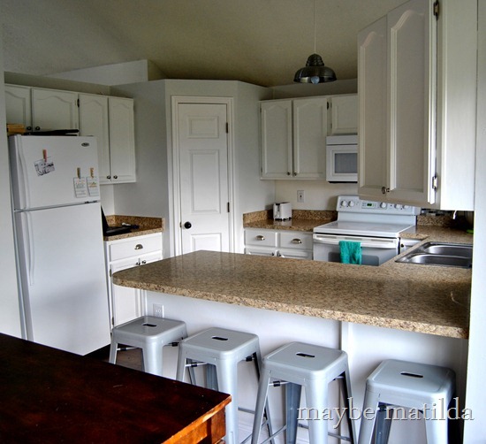
When we bought the house:
With the addition of new floors, counters, sink, and light fixtures, and after repainting the cabinets:
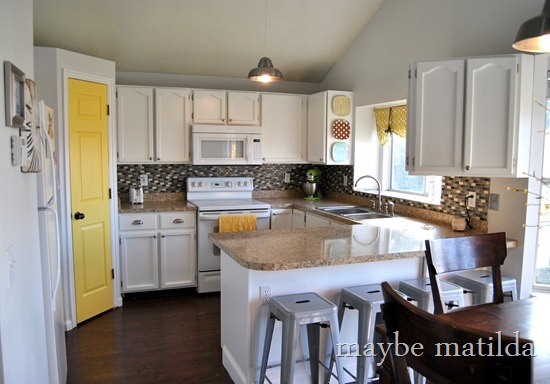
And today:
Yay! Color!
The biggest project we undertook since the last time I shared pictures is the backsplash. Jeff and I installed this ourselves a few weeks ago, and were actually pretty surprised at how simple it was. This was our first time working with tile, and after about 3 months of staring at just one sample sheet of tile propped up against the wall, we finally worked up the courage to get started.
This picture makes it pretty obvious that we’ve got some touch-up work to do. We used Tile Setting Mat instead of mortar, which was great in some ways (for tiling beginners like us who had zero experience/confidence, it completely eliminated one scary step of the process), and less great in others (since we didn’t measure and cut it 100% perfectly, we’ve got about 1/4-1/2” of empty, uncovered mat poking out between the top of the tiles and the bottom of the cabinets, which isn’t very pretty). But as you can see, we decided on a mosaic tile, which I really love. I think it adds a lot of texture and interest to our previously bland kitchen. The mosaic tiles came in 12x12” sheets (this isn’t the exact product—I can’t seem to find our tiles online—but here’s a very similar-looking one from Home Depot), and are a mixture of travertine and glass tiles.
But even with the nice new backsplash, I still wanted some more color. I figured the pantry door was a good place to start.
Here’s the view toward the pantry, mid-renovation:
And now:
It was such a simple, inexpensive way to add some personality and color to the room. I used Valspar Almond Glaze, and had the whole thing done before Forrest even woke up from his nap.
I sewed a quick little curtain (using leftover curtain fabric kindly sent to me by my buddy Kim of Newly Woodwards—thank you, Kim!) to carry the yellow across to the window, and hung a few decorative plates on the side of a cabinet to add a little more character.
(I’m posting at The Bungalow Boutique’s blog today with the curtain tutorial—head over there to see how I made it!)
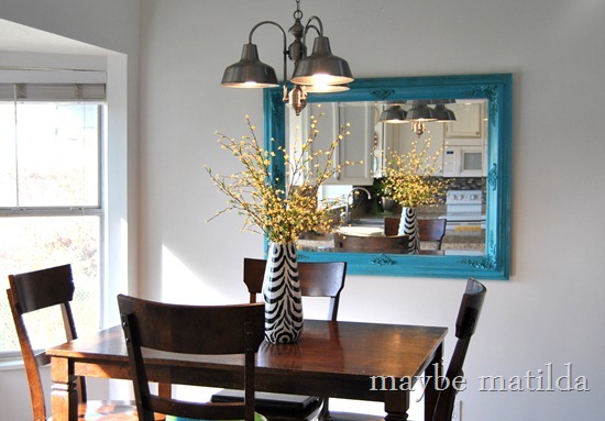
My turquoise mirror (an old gold hand-me-down mirror that got a coat of spray paint) and a vase of (fake) forsythias pull the color across into the dining area as well:
I can hardly believe this is the same kitchen that we moved into. I suppose it’s not, in many ways. But thank goodness for that. And I think I’m done with this room for a while. Just as soon as I decide if the big bay window needs some sort of treatment. And whether or not I should give my scratched up, worn-out table a makeover of some sort. Then I’ll be done. For a while.


I love the punch of yellow, it really brightens up the room! I think adding yellow to the bay window area would tie it all together.. IMHO!
ReplyDeleteWelcome to my world. Rooms are never done. It's some kind of weird game.
ReplyDeleteI do love the yellow door. It makes me happy. I'm also sending the link to my mom for your window treatment. It's just what she needs. She may not know it but it is.
Looks awesome! Love the yellow door and accents! I appreciate your speed in getting things done in your new house. I wish I still had the motivation and excitement I had when we first bought our house. Hurry and get more projects done while you have the momentum because if you're anything like me, 3 years down the road you'll have all these ideas and no motivation to execute them. Hah! :)
ReplyDeleteLove that you uses an accent color on the door! Oh and just so we can bond over more things we have in common.... I have that dining room table :D
ReplyDeletewhat a great idea! so many people around these parts have this same layout, it's great to see some new and fun ideas to make each home unique!
ReplyDeleteLove the backsplash and the yellow! It's nice that your kitchen is versatile.. if you get bored of the yellow- you can repaint that door and put up new window treatment.. easy!
ReplyDeleteThis looks SOOO good. I love the yellow door and the curtain looks really great. I just love that fabric. I think the contrast with the turquoise mirror is perfect, and the tile looks awesome. I love that it has different shades of brown and even some grey. Really nice!
ReplyDeleteI love love love the painted pantry door for a pop of color :) it all looks sooooooo good!
ReplyDeleteLove your kitchen!! It's so pretty! :) Have a great week! hugs, Holly
ReplyDeletei am in awe. you're awe-some.
ReplyDeleteI gasped right out loud! That door. THAT DOOR!
ReplyDeleteLooooove it!!!
ReplyDeleteI just love your blog. Your personality truly shines through - I feel like I know you (without getting creepy of course)! I truly appreciate that you are a budget friendly resource for craft projects!
ReplyDeleteI just painted my kitchen walls but was considering painting the cabinets white. I LOVE how yours came out and I also LOVE the painted pantry door. Here is my kitchen: http://wvcountryroads.blogspot.com/2012/10/no-more-red-kitchen.html
ReplyDeletedo you think it would look good white? I did the island but was scared to do the rest.
Lisa
YES! I think that would be beautiful! I love the new wall color--so modern and pretty. I think white cabinets would look fantastic.
DeleteThe color pops and tile all look great! Nice work!
ReplyDeleteI love the pop of yellow...it looks so cozy. Gaaaaaw gous!
ReplyDeleteOh Rachel! I love it! The yellow and turquoise are great!
ReplyDeleteA splash of color on a all white kitchen is just the thing to brighten it. Love what you did there.
ReplyDeleteFrom the Pen of Lady G
Lady G on Tumblr
Lady G on Facebook
Twitter @bloggerladyg
xx
LadyG
Love me a good pop of yellow and turquoise!!!
ReplyDeleteBeautiful dditions to your kitchen!
ReplyDeleteI'm pretty sure I've said it before, but I'll say it again... you are a rockstar! Your kitchen looks absolutely amazing!
ReplyDeleteOk, so glad to know about the simplemat thing. Also, I acutally love your kitchen table & chairs. Where did you get them?!
ReplyDeleteThank you! They were actually a hand-me-down from my parents--I'll see if my mom remembers where they're from.
DeleteRather then touch up the top of the tiles, you probably could just get some 1/4-round trimming (I think that is what it is called?) and paint it white and put it in that space. Those tiles are pretty stellar!
ReplyDeleteEverything is so cute! Where did you find those darling plates??
ReplyDeleteThanks so much! I love those plates--I got them a few years ago from my mom's shop, The Bungalow Boutique in Heber (UT). I don't know if she still carries them, but she's always got tons of cute plates!
DeleteI will check it out! Thank you!
Delete