I initially titled this post “Full House Tour,” which felt more succinct until I realized people might think it was a tour of the Full House set, and that would really disappoint any Full House fans who are reading.
We’ve spent 3 years here in our first house. We have loved it so much, and have put a lot of work into making it feel fresh and up to date and ‘us.’ But we’ve been feeling lately like it’s time for us to make a change, so we spent the last few weeks finishing up unfinished projects so we could put our house on the market.
It went up for sale on Tuesday, and we’re excited to see what happens. We’re planning to stay in the area (we are currently in Lehi, Utah, and don’t plan to go far!), but we’re ready for something different. We’ll be said to leave this house and neighborhood behind, though . . . we have loved transforming this house, and we have great neighbors and friends here.
The house has been listed since late Tuesday night . . . and we had 10 showings on its very first day. I’ve never sold a house before so I guess I can’t say anything definitive, but to me, this seems like a lot. I can’t even tell you how weird it was to come home after an entire day away from home and know that strangers had been passing through our home all day long. It felt bizarre, and of course it is such a hassle to try and entertain kids out of the house all the livelong day, so I really really hope that it goes quickly.
I thought today I’d give a full tour of this house. A lot of work and love went into it—it was very ‘cookie cutter’ when we bought it, and had been a bit neglected by renters for a few years before we took over. And I’m really proud of what we’ve done here . . . I think we added so much personality and charm to what started out as a very basic, boring house.
If you’re interested, you can see all the ‘before’ pictures in THIS post.
We’ll start right at the front door. Here’s the view when you walk in.
I remember the first time we looked at this house—the thing that I noticed right away was how bright it was. And that is still my absolute favorite thing about the place. There are lots of windows, and it gets tons of gorgeous natural light during the day.
Here’s the same view when we bought the house:
The main changes here were tearing out the carpet and old laminate, and replacing it with a new, dark wood laminate. We also switched out the light fixtures in the kitchen with new ones from Barn Light Electric, and painted everything.
To the left is the living room, where we spend a lot of our time. There is no overhead lighting in this room, so we had an electrician add these sconces (which are actually outdoor barn lights from Lowe’s).
The incredibly high ceilings in the living room and kitchen are another awesome feature in this house.
Straight ahead is the kitchen—I’ve always liked that the dining area is visible from the front door, but the kitchen isn’t. Slightly lower pressure for me when visitors arrive unannounced—if the kitchen isn’t spotless, no worries, they can’t see it from the door anyway.
I love those light fixtures from Barn Light Electric (I won them in a giveaway shortly after we moved in, and they provided a perfect jumping off point for how I wanted to style the rest of the space), and I’ll be so sorry to leave them behind. I think they add so much charm and character to the house.
This kitchen looked rather bland and boring when we moved in, but I think it turned out to be one of the best makeovers in the house. It looks so fresh and inviting now.
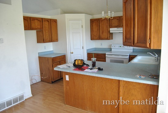
Below is the kitchen when we moved in. Obviously, lots of changes here! We painted the cabinets white and added hardware, replaced the light fixture, replaced the sink and countertops (the new countertops are a laminate from Lowe’s), installed a mosaic tile backsplash, and added a pop of color on the pantry door.
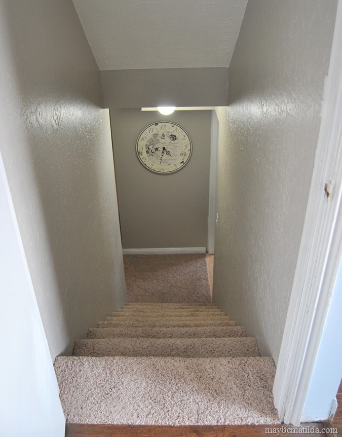
To the right of the kitchen are the stairs heading up and down. The biggest change here was to knock out a wall that blocked the family room from the upstairs, plus we installed new carpet upstairs and painted the banister for a two-tone look.
Down a few stairs is the family room. I’m kicking myself that we didn’t work on this room sooner. It wasn’t until my mom suggested painting the fireplace a few months ago that we spent any time or effort on this space . . . and now it’s the cutest room in the house.
This room is rather long and skinny—on this end is the fireplace and TV, and on the other end we have our (very old and out of tune) piano. I wish I could tell you I’m an accomplished pianist . . . but most of its playing these days comes from the kids pounding on it.
Here’s what the family room looked like when we bought the place:
We continued with the dark wood laminate down here, painted the fireplace, repainted the walls a pretty, soft blue, and replaced the big clunky fan with a schoolhouse light from Barn Light Electric (I’m telling you, winning their giveaway was the best thing that ever happened to this house!).
I’m sorry to report that the green basement from Tuesday’s post did not stay for long. I maintain that it is a fun color . . . but we worried that it might scare buyers since it really is so bold. We repainted the basement and hallway in this pretty taupe (it is called Perfect Taupe by Behr, and I had them tone it down by 25%).
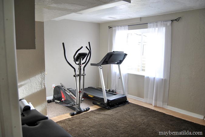
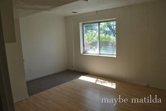
There are two unfinished spaces to the left of the stairs that we use for laundry and storage (and they aren’t worth showing you), but to the right is a large open room. We basically never used it in our 3 years here (*kicks self SO HARD*), but the plan was always to turn it into a combination craft/exercise/play room. We finally did it, just in time to sell the dang place.
We had to replace that window, which someone in the house’s past installed backwards, so it couldn’t be opened . . . but someone at some point gave it a good effort anyway, and the frame was completely bent and useless. Geniuses.
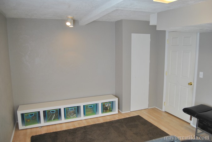
A new window and a fresh coat of paint, and it was like a whole new room. We put our exercise equipment on one end of the room, and toy storage on the other end. I went on a ruthless toy purge recently, and all the toys in the house are now in those boxes. Literally, that is everything. I cannot tell you how awesome it is to not have toys in every room of the house now.
All of my craft/crochet supplies are hidden behind that little door. This room actually has two closets, which is awesome. Storage for the win.
Here’s the basement when we bought the place. We didn’t do a ton to this area—just painted, replaced the window and added a small windowsill, and cleaned things up:
Let’s head back upstairs.
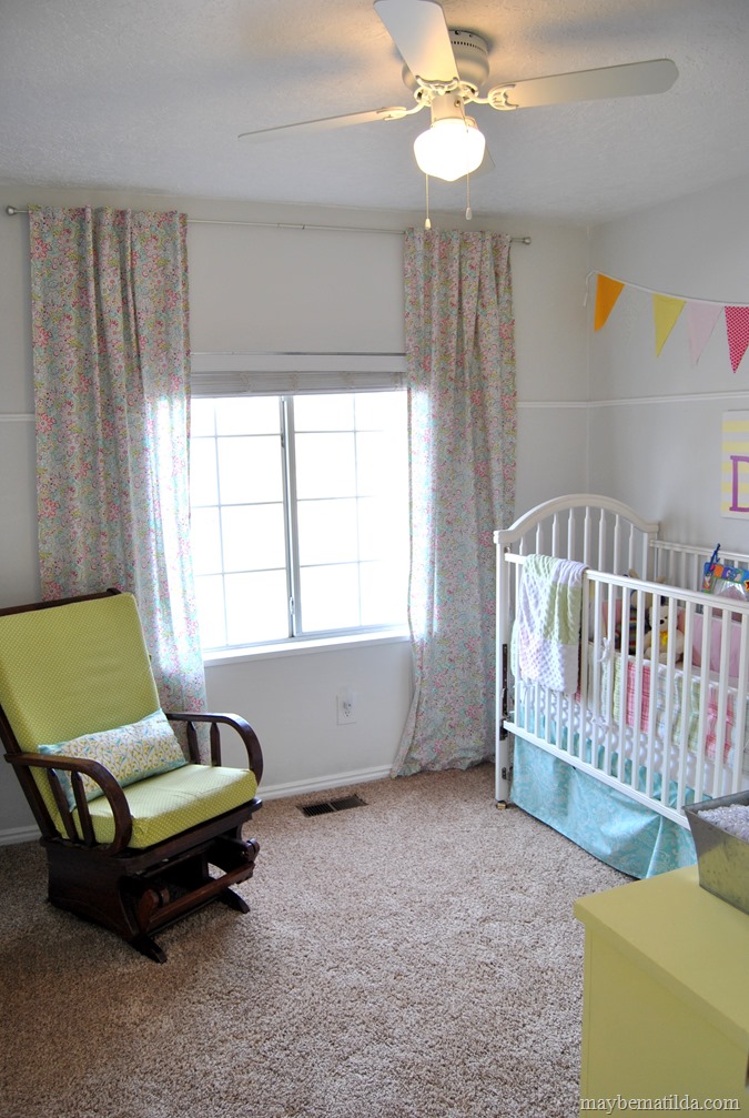
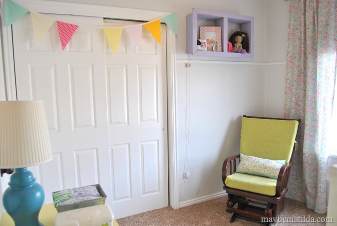
The first bedroom upstairs is Darcy’s. It’s not a very large room (and the photos make it look positively tiny!), but it’s a great size for her right now.
This next photo would lead you to believe that I can’t even open her dresser drawers. I’m not sure why it looks that way—there is actually a fair amount of space between the dresser and crib. I must have the wrong camera lens for taking interior shots.
Another feature I’ve loved in this house is that the closets are really spacious. Lots of great storage room for clothes, toys, out of season items, laundry baskets, etc.
The bedrooms in this house didn’t require tons of work—just the same new carpet we installed throughout the upstairs, and a fresh coat of paint. Darcy’s room also got a new light fixture—her old one was very dingy-looking, plus made a ton of noise when the fan was turned on, which made it basically unusable. I don’t have a before picture of her room.
Then we’ve got Forrest’s bedroom. Probably the room in the house I spent the least amount of time and planning on. It didn’t ever really make much of a transition from baby room to kid room, so I’m not terribly proud of the layout/design in here, but I’ve got some good ideas for his big boy bedroom when we find a new place.
Once again, I love that big window. We had blackout shades over his window until we listed the house, when we swapped them out for these sheer drapes which really show off all that light. Surprisingly, the lack of blackout shade doesn’t seem to bother his sleep at all. I’ve still caught him occasionally napping in here in the afternoons (he doesn’t nap often anymore, but sometimes the stars align!), and the brightness is roughly equal to that of the surface of the sun.
Like I said, not the cutest bedroom design you’ve ever seen. In my defense, it looked a lot cuter with the old curtains and when the crib was in here.
Here’s his bedroom before:
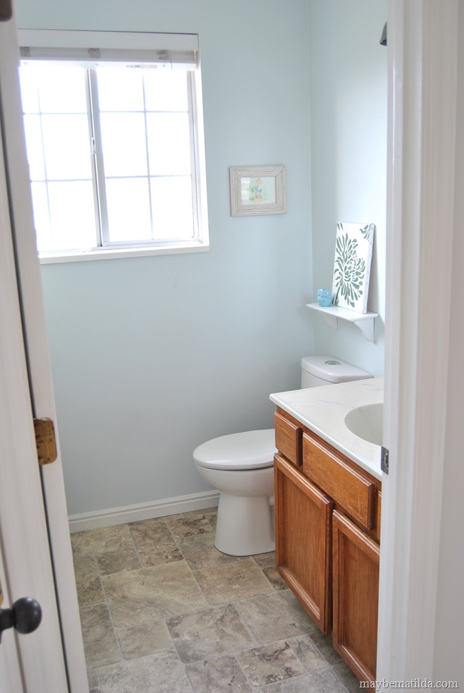
Then we’ve got the kids’ bathroom. To prepare to list the house, we replaced the floors and toilet in here. I always planned to paint or stain the vanity, but never got around to it. Maybe the next owner will be a little more motivated than me!
And once again, a Barn Light Electric fixture totally makes the space.
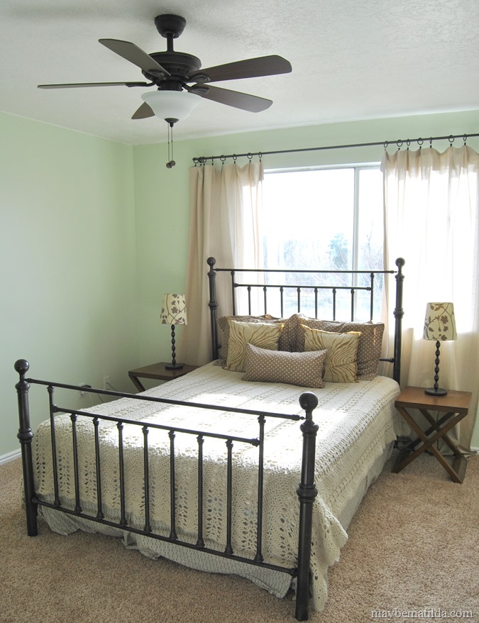
Then we’ve got the master bedroom. This is my favorite paint color in the entire house. Sort of a light celery green. I think it’s soft enough to read more or less as a neutral, but it has some personality (which is especially helpful since all our furniture and linens in here are shades of brown).
And from the other direction. I maaaay have overdone that gallery wall. Looks a little wild.
In the bedroom, our only change was paint, plus swapping out the old bulky fan for a newer one. Here’s the bedroom before:
The master bath isn’t anything breathtaking, but it has the benefits of being clean and very bright, which hopefully counts for something. In here, our only change was to update the light fixture (which previously was one of those bare-bulb strip light fixtures—not my favorite look).
I’ve always loved our backyard. Plenty of room for Forrest to run and play, and I love that it is fully fenced, so I don’t feel like I necessarily have to watch him like a hawk while he plays.
As well as a nice big front yard, too.
Outside, we put a lot of effort into taming the landscaping (which had gotten pretty wild before we bought the house), and adding a little curb appeal by installing shutters, painting the front door a crisp black, and installing new outdoor light fixtures.
Here’s hoping this place that we have put so much love into sells quickly to a family who will love it just as much!











No comments :
Post a Comment
Thanks for commenting!